I am not a photoshop professional, but I have used photoshop professionally, retouching images for clients, etc! If @crullers wife has any problems in terms of availability then I would be happy to have a go. It’s a great idea. P.S. I concurr regarding Windows 8. My aged parents have just bought a new PC that came with it and I am trying to sort it out for them. My father is nearly 80. He thinks the reason he has trouble with it is because of his age and lack of familiarity with computing. I have said to him, “No, it’s because this product is s**t!”
@TheBoggart We ended up being a bit more busy this weekend then we intended so if you want to give it a whirl go for it! The hardest part to me is finding a decent snuff box pic that would work well with the painting.
Agreed. I have done a quick n’ dirty one just to see what it looks like and actually it isn’t too bad. Just need to add some snuff into the snuff box. Will post when finished to see if it is on the right lines, then work it up a bit more if people are happy.
Here is a quick one that I have botched together. I can do a more polished version (look for a better snuff box pic and spend more time on cutting out etc) but thought it was worth checking that it was on the right lines. 
^ that looks pretty awesome!
Absolutely superb!!
I can probably get the angles a bit better if I can find another snuff box pic, then there was something about getting some tobacco leaves in the background, which I may also be able to do if I can find a suitable image. Bit busy tomorrow but should have some time towards the end of the week.
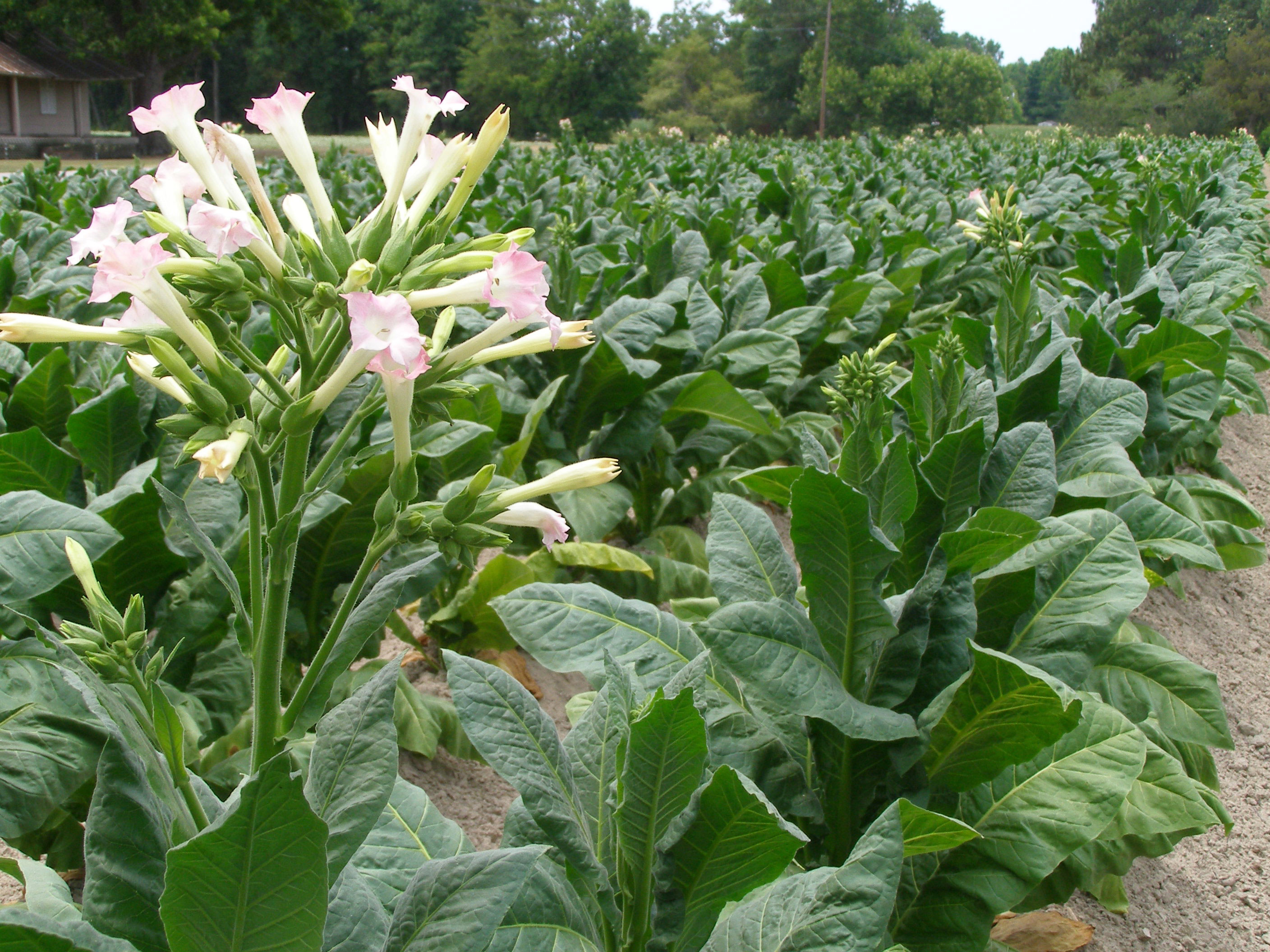
@TheBoggart If I may make a suggestion if you could get the gold bar borders in and Preferably Adams right arm and leg. I believe the focus will be on the snuff box if it’s a little off center . Other than that, excellent job so far. I think The International Snuff Taker’s Association should go across the bottom on a wavy ribbon; colors similar to the vortex of heaven. Font of your choice and in smaller print [founded 2007] Or established 2014 . I guess these details should be voted for. Any other suggestions or comments this is our Association all members have a voice. Together we will grow. http://image.shutterstock.com/display\_pic\_with\_logo/615640/615640,1283622333,1/stock-photo-blooming-tobacco-plants-with-leaves-flowers-and-buds-60336574.jpg http://www.chloesblog.bigmill.com/uploads/Image/tobacco-flowers.jpg
I think if we can get a consensus on the features I will do a big version that includes the whole image and a smaller version that is cropped in on the hands. In many instances, using the whole image would cause the details to get lost, so a smaller version would be useful. Regarding the banners and bits, it’s doable provided that I can find free stock imagery to use - drawing them from scratch requires knowledge of a different piece of software called Illustrator that I am not so proficient with (not sure I actually even have my own copy). But there should be enough to choose from, it is just a case of finding a suitable one: https://www.google.co.uk/search?q=scroll+banner&client=firefox-a&hs=0yP&rls=org.mozilla:en-GB:official&channel=sb&source=lnms&tbm=isch&sa=X&ei=S3wEU6edNePA7AaF34HQBw&ved=0CAkQ\_AUoAQ&biw=1525&bih=678&dpr=0.9
Just to be grammatically correct, it should be the “International Snuff-Takers’ Association” Hyphenated I think is correct, but Takers’ (apostrophe after “s”) indicates both plural and possessive - that I am sure about. I know grammar and punctuation are not important to a lot of people, and certainly not in casual postings, but this is our public face. We have to look the part. White tie and tails. Yeah, I know its not right on the forum category title, I need to fix it. Actually I’d like both dates in it. Conceived: 2007; Established: 2014 Seven years is a long gestation, but i’m glad you guys are here now to inject some fresh ideas and energy into the project.
I like this one
Yes, that’s good. However, beware Xander’s point above about apostophes - as it stands the picture is advertising an International Association for a single snuff-taker… :-B
To avoid confusion may drop the ['s] all together
I think the apostrophe could go and it still be grammatical. A logo doesn’t have to follow strict rules. @basement_shaman - I like the way you are dealing with the questions on the forum, good job so far. As far as questions about the two year rule; most accounts are dormant by that time. Might help you if Alex or Chris could give a statistic on that?
I can gather statistics. Let me know what information you want. There are indeed hundreds of dormant accounts.
here it is with ’ at the end and a -
It be nice to have some numbers to back up the dormant examples
It looks good to me. I think you got the perfect font, too.
"Now hoooooold on thar, Baba Looey! I’ll will not do the “thinnin’” around here, and doooon’t you forget e-it! . I like to see other Ideas and concepts. If no others materialise, then it should be voted on to be adopted. I would like to see more participation from the other 24 +/- members.
Well as I have no artistic talent and am a dunce with photoshop type things, I have nothing to submit other than opinion on others’ work.